By: Katie Clarey for HR Dive, Photo by Robert Katzki on Unsplash
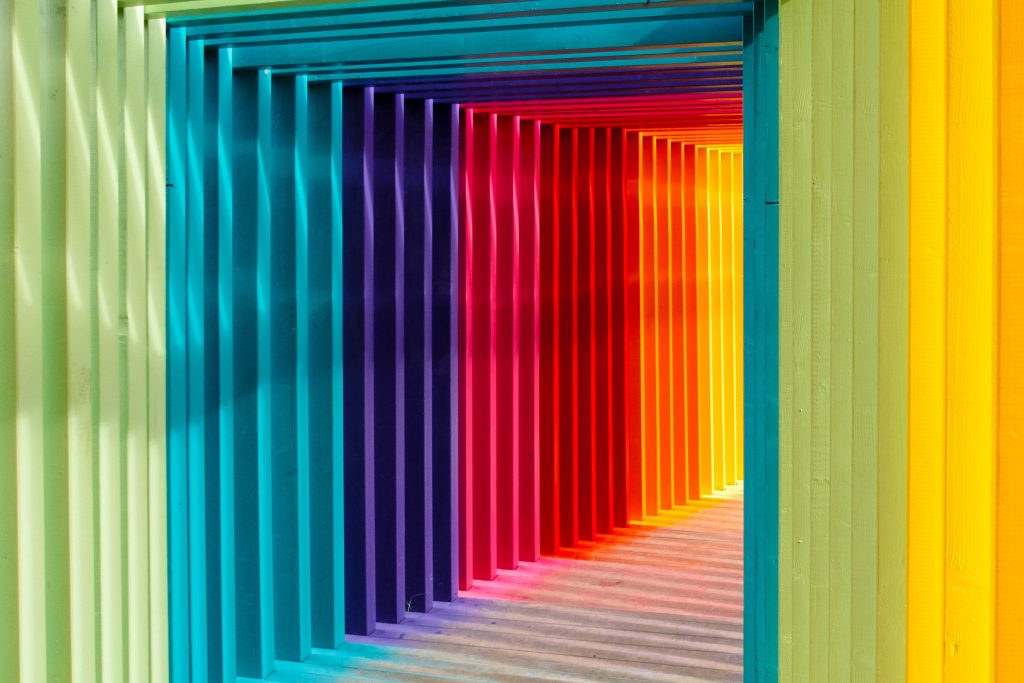
The fire-red paint swept across one wall of a conference room plays a surprisingly important role in workplace culture and employee engagement. So does the sunshine-yellow couch inviting guests into a lobby, along with the banana leaves stenciled onto the wallpaper adorning a wellness room.
Color defines a workplace’s setting and can manipulate workers’ moods, according to Nicole Andreu, senior vice president and design director of commercial interiors at CannonDesign’s New York City office. “Red has energy and passion. Yellow is for happiness. Green is for growth and stability,” she said.
This can all be explained by something called color theory, which, among other things, allows designers to understand the context of how color is used, Andreu said. With workplaces becoming more vibrant, at least in design terms, HR professionals may want to consider how color choices might affect workers, Associate Director of Drexel University’s Interior Design Program Ada M. Tremonte said. “We’re beginning to talk more about people and human performance and behavior, and how you can actually change someone’s behavior by their environment, which is why HR is getting involved in a lot of this,” she said.
What is color theory?
There is no tidy definition of color theory — it can mean a lot of things, Andreu said. But for her, it provides the reasoning behind why a brush of burnt orange would work in a space when a splash of lime green wouldn’t. “I think color theory is the way color combinations affect our surroundings,” she told HR Dive in an interview. “Color affects our mood. It can create balance or imbalance depending on how it’s used.”
Tremonte’s explanation echoed Andreu’s. “Color has the ability to change how people feel,” she told HR Dive in an interview. “It can calm people, it can bring people together, it can make people excited.”
Whichever color is chosen, it produces an effect; that’s what color theory posits. “I’m a strong advocate for a use of color in a setting to manipulate mood because it does have an effect on how we feel,” Andreu said.
Need energy? Paint the office red
Color theory helps explain how color works as an element of design, but it also goes further to help designers and artists predict how a color — even a particular shade of a color — might impact the viewer.
Imagine the entrance to an office, for example. Now picture that area set off by walls coated in a deep eggplant. “We use dark colors to create some mystery when you’re walking into a space,” said Lauren Dennison, design director at design firm Vocon. “We use brighter or more intense colors to create moments that leave a lasting impression on people who are walking through the space or experiencing the space first hand.”
To create a relaxed and calming atmosphere, Andreu incorporates green and complements it with neutral colors on the gray and white spectrums. Primary colors can generate a lot of energy in a space, Andreu said, specifically noting that red is not the only color to elicit such a feeling. Primary colors are versatile, too — “you can use them in so many different ways,” she said. Bring in carpet, pillows and textiles to fill a space with primary colors.
While workplaces are beginning to feature more reds, yellows and blues — alongside green and coral pink, a popular combination right now, Andreu said — office design currently favors warm whites, too, said Dennison. “I’ve been seeing a lot of trends that are a direct reaction to the very corporate white, sterile-looking office spaces of the past 15 to 20 years. They’re looking for something a lot warmer, more like a living room feel,” she told HR Dive in an interview. “You can do that in a really simple way by using warmer whites. People are scared of white, but it makes the office very bright and clean. You can use a warm gray to make something feel really inviting.”
Picking a palette
The power of color is so strong that those deciding on color for a workspace must use extreme care in putting together a palette to ensure it supports the company’s mission and culture. Tremonte takes care to consider the type of company. “If it’s an accounting firm, it’s going to be a little different than if it’s a dot-com social media firm,” she said.
Even more important than choosing the perfect navy or the appropriate lavender as accents? Setting the basics, according to Dennison. “It’s amazing — the white and the neutrals in a space set the tone of how someone perceives a space, whether it’s cool or warm,” she said. “That’s where we start, and then we build off of that.”
Color at work: branding and wayfinding
Organizations use color within their office to create employer branding. Color takes on particular usefulness for employers looking to make the workplace comfortable for employees who prefer an informal environment, Andreu said. “Businesses are trying to attract young talent who feel the workplace is an extension of their home,” she said. “Color is becoming more used. People are layering color more. They’re using pops of color more.”
It’s possible for a company’s brand to infuse a workplace through color. A salon’s headquarters, for example, might use the bubblegum pink found in its logo throughout its building. But it’s not always that easy. Sometimes, the colors used in a company’s branding clash with the culture it tries to promote in its office. A pet store franchise might use red and yellow in its logo. Inside its headquarters, however, it wants to cultivate a relaxed, informal atmosphere.
This could create a challenge, but it doesn’t present an impossibility. “I think there are ways to infuse a brand without having the logo splashed around the office,” Andreu said. Companies in such predicaments could pick neutrals and colors that complement the branding colors and bring in the logo only once within the space, to draw maximum attention to it without overdoing the colors.
Color can help with wayfinding in a workplace as well, Tremonte said. Employers can use color to differentiate spaces from each other. “People are encouraged to work anywhere they want in the office, and there’s different qualities of places to work from very focus-oriented where you really have to have quiet and heads down and working alone to where you’re really working with other people,” she said.
Quick tips
- Choose neutral colors first. “You can make a big statement by picking the perfect white or neutral,” Dennison said. Then add color where people are going to notice it. “When you have a mass of people’s work stations, you want that to disappear,” she said. This is not the place to add a magenta tapestry threaded with gold. Save that for the reception area and paint the work area white.
- Work with key decision-makers to pick colors. “Personally, I would pick a few colors that represent a feeling that your leadership would want to convey, and then I complement those colors with other materials like wood, stone or metal,” Andreu said. “Complementing colors with other materials is important.”
- Make a comprehensive palette. Get samples of a space’s surface materials, like flooring, and add potential colors. “It’ll be much easier to choose the tones that are in your space,” Dennison said. “Stand in the space, pull in the wood and make your choices that way rather than picking it out of thin air. It’s impossible to do that and come up with a good solution.”
- Go for it. “Don’t be scared to take a risk and try something bolder if your goal is to make a statement,” Dennison said. “You can always repaint.”
Read the original article here. Sign up for our newsletter here.